
Code-related feedbacks, suggestions and ideas
Hi everyone,
In parallel of my work of rewrites and bug fixes, it seems important to me to benefit from your regular feedbacks to feed me with ideas which would allow me to always improve the site. This can be elements related to the ergonomics or the graphics of the site, possibly to its functionalities:
Of course, this subject only concerns technical requests: anything else related to the game and life on the site is off-topic.
All of your requests will be read and studied: I won't necessarily answer them (it takes time!) but I will put them in my "to-do list" as soon as they seem relevant, feasible, and the complexity of realization is worth it!
It's up to you
In parallel of my work of rewrites and bug fixes, it seems important to me to benefit from your regular feedbacks to feed me with ideas which would allow me to always improve the site. This can be elements related to the ergonomics or the graphics of the site, possibly to its functionalities:
- things that you don't find very practical to use ;
- others that you find difficult to understand, not very emphasized;
- things that are not pretty, misaligned or imperfect;
- small additions that could be useful or even life-changing.
Of course, this subject only concerns technical requests: anything else related to the game and life on the site is off-topic.
All of your requests will be read and studied: I won't necessarily answer them (it takes time!) but I will put them in my "to-do list" as soon as they seem relevant, feasible, and the complexity of realization is worth it!
It's up to you

Code-related feedbacks, suggestions and ideas
Just copying over my suggestions from the other thread
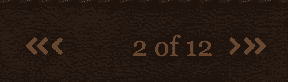
1. I think it would look at bit better if there was more space between the button to go forward/backward one page and the button to bring you to the start/end of the thread. The way it is now, a brief glance makes it look like there is just one button with three arrows. This isn't a big thing by any means, but it might make the site a bit more user-intuitive. (Note: They look much closer together on the actual site than in the below screenshot because they're smaller)
Reducio
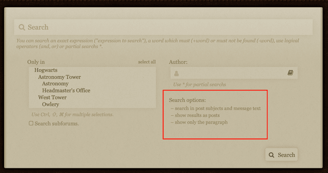
2. Another formatting thing is if the search options could look a bit more like drop-downs instead of just a list of information. I didn't even realize they did anything until I accidentally clicked on one of them. Maybe if there was an outline around each option or something, it would be more obvious? I'm not sure.
Reducio
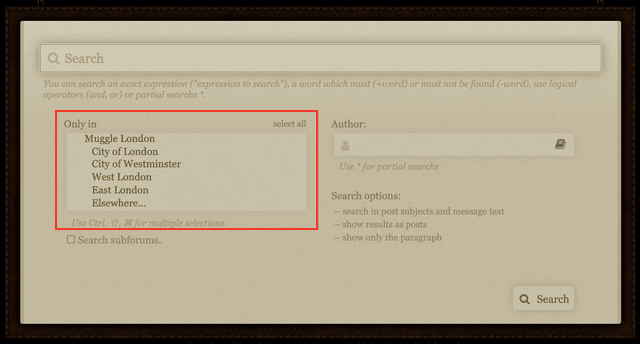
3. Also with the search screen, it would be amazing to have a way to search for a specific forum in the filters. There are a lot of forums and subforms to scroll through in such a small place, and although it will probably be a lot of work to implement, I think it might be worth it. I understand that Zachary is really busy, and don't expect this to be done any time soon, but I might as well plant the seed for the idea.
Reducio
4. A quick-link at the bottom of the site to your drafts page would make life a lot easier. As it is, you have to first go to the "favorites" page, then go to the dropdown at the top and click on the "drafts" option. As someone who does most of their writing in a stop-and-start fashion, adding the quick-link and taking out that extra step would be super helpful. If the extra link in the footer doesn't fit on mobile devices, a solution might be to just hide it on smaller screens. Having the quick-link some of the time is still better than none of the time.
Reducio
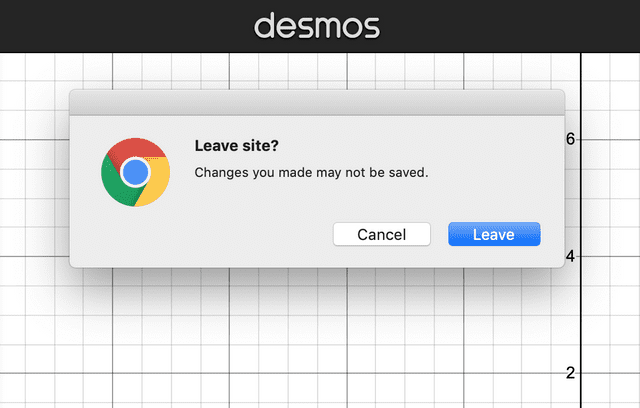
5. I honestly have no idea how hard it would be to implement this, but an alert for when you try to leave a page with unsaved changes to a draft would be really helpful. I know a lot of people just write their replies elsewhere, like Microsoft Word of a Google Document, but this would help the site be less reliant on other services. I think I've heard other suggestions about having an auto-save feature, but I feel like this might be easier to implement. If not, feel free to correct me. (The screenshot below is an example of what I'm thinking about from Desmos, an online graphing calculator)
Reducio
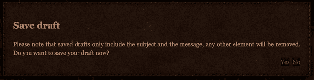
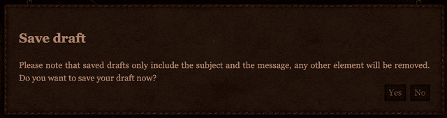
6. This is a new one, but I think some of the buttons on the site might look a bit better and be easier to click with more padding, in particular on the "save draft" page. I went into Inspect Element and played around a bit with it, the buttons in the picture below have a padding of 3 pixels on the top and bottom, and 7 pixels on the left and right. Obviously, you can choose whatever values look best, but I think the padding makes them look a bit less smushed.
ReducioBefore
ReducioAfter
You're the best, Zachary!

"Life is like riding a bicycle. To keep your balance, you must keep moving." - Albert Einstein
STA: 4 | EVA: 4 | STR: 3 | WIS: 9 | ARC: 8 | ACC: 7

Code-related feedbacks, suggestions and ideas
First of all: Thank you Mr Winslow for dedicating your time, energy, and patience for this site! It's awesome!
Something I'd like to suggest: when we try to tag someone (using @), a list of names that match the letters we've typed will appear. This is great, except for one drawback - on PC, we have to use mouse to choose the name because when we use the down arrow, the name list isn't scrolled down.
I think it'll be more practical if the name list can be scrolled up and down using the arrows on keyboard as well, just like a post can.
I'm not sure about on mobile since I only use computers to make longer replies which require tagging someone.
Thank you in advance! : )
Code-related feedbacks, suggestions and ideas
I've been thinking about this for a while, but wasn't sure if it was possible, so I didn't suggest it. However, the newest fix for entering other houses' dorms made me think of it again. Right now, when you click the "x" button on the Marauder's Map, it immediately takes you back to the site's homepage. However, it might be helpful if instead of this, it took you to the last place you were, like the "x" button used in the update does. For example, if I open the Marauder's Map in the Library, when I close it, it would take me back to the Library.
Additionally, I thought you might like to know that the two "x" buttons are different colors and sizes
I really appreciate everything you do, Zachary!


"Life is like riding a bicycle. To keep your balance, you must keep moving." - Albert Einstein
STA: 4 | EVA: 4 | STR: 3 | WIS: 9 | ARC: 8 | ACC: 7

Code-related feedbacks, suggestions and ideas
Not really very pressing or important, but I find myself increasingly wanting a "favourite place" type of function, like the favourite threads, but with forums.
There are some forums I visit very frequently coughs to stalk duels coughs, and currently I usually go My Messages -> A thread in the respective forum -> back to the forum, because it's quicker than scrolling through the dropdown and searching for the location I want. Would be neat to be able to skip going through a thread, esp since I sometimes have to look for that thread, too.
There are some forums I visit very frequently coughs to stalk duels coughs, and currently I usually go My Messages -> A thread in the respective forum -> back to the forum, because it's quicker than scrolling through the dropdown and searching for the location I want. Would be neat to be able to skip going through a thread, esp since I sometimes have to look for that thread, too.
"One can never consent to creep when one feels an impulse to soar."
| Sta:7 | Ev:15 | Str:3 | Wis:14 | Arc:8 | Ac:16 | Evasive Maneuvers | Charmer | Perfectionist II | Spell Spread---------------- | HC: #004064 |

Code-related feedbacks, suggestions and ideas
So this is only a suggestion that isn't necessarily needed but it might be helpful. I find it frustrating to hover my mouse over my profile and trying to click my name without going off. That's not the problem. When we try to go you our ency~ there are just more moves for us to make. Maybe there could be an icon for that under our profile in the top right? Just a thought. I love everything you do
"Deep into that darkness peering, long I stood there, wondering, fearing, doubting, dreaming dreams no mortal ever dared to dream before. "
-Edgar Allan Poe
"Deep into that darkness peering, long I stood there, wondering, fearing, doubting, dreaming dreams no mortal ever dared to dream before. "
-Edgar Allan Poe

Code-related feedbacks, suggestions and ideas
A suggestion that I have is that there is a way to delete previous drafts. For example in the Applications for specialty races or abilities I have 20 drafts, some of which date back to 2019. This would be like a little x button to the side of the draft list. Or a select button where you could click it and then click delete selected, then another box would pop up asking if you want to confirm our deletion. This is just an idea because I know that some people go in and out of drafts frequently and have used the same thread many times. I was just thinking that this might be useful thank you for all the new updates, the site looks the best it’s ever been!

Code-related feedbacks, suggestions and ideas
There is a way of doing this on the Drafts page - just select the ones which need deletingLavinia Cloven wrote: ↑16 Feb 2021, 21:38 A suggestion that I have is that there is a way to delete previous drafts. For example in the Applications for specialty races or abilities I have 20 drafts, some of which date back to 2019. This would be like a little x button to the side of the draft list. Or a select button where you could click it and then click delete selected, then another box would pop up asking if you want to confirm our deletion. This is just an idea because I know that some people go in and out of drafts frequently and have used the same thread many times. I was just thinking that this might be useful thank you for all the new updates, the site looks the best it’s ever been!
│= | #00308F ency • cassie heather | =│ | breathe in, breathe through, breathe deep, breathe out Part-Veela • Alluring • Perfectionist • Scream • Sta 9 • Eva 9 • Stre 4 • Wis 10 • Arc 8 • Acc 9 | │ |

Code-related feedbacks, suggestions and ideas
I was thinking that it would be useful if there was a way to mention a bunch of people at once, like clubs or something. For example, when someone wants to mention all the people in a club for whatever thread or such that they are doing, then they just put the name of the club in the mention code and everyone in it gets a notification. This is just a suggestion that I think would be quite helpful for times when you want to mention a bunch of people, but this site is already very amazing!
⋆ You were given this life because you are strong enough to live it⋆
Sta 8 ⋆ Eva 6 ⋆ Str 3 ⋆ Wis 7 ⋆ Arc 5 ⋆ Acc 6
Sta 8 ⋆ Eva 6 ⋆ Str 3 ⋆ Wis 7 ⋆ Arc 5 ⋆ Acc 6
Code-related feedbacks, suggestions and ideas
Genuinely not sure if it's always been that way, but while replying to an owl conversation, if you have the "Previous owls" section extended, the "Save"/"Preview"/"Send" buttons are now at the very bottom, below the entire owl conversation. Imo it would be a lot more user friendly to have them directly below the owl you're currently writing instead.
You're absolutely killing it with all the rewrites lately, I don't want to guess how much time you've been putting into this, but every minute is appreciated. Thank you.
You're absolutely killing it with all the rewrites lately, I don't want to guess how much time you've been putting into this, but every minute is appreciated. Thank you.
"One can never consent to creep when one feels an impulse to soar."
| Sta:7 | Ev:15 | Str:3 | Wis:14 | Arc:8 | Ac:16 | Evasive Maneuvers | Charmer | Perfectionist II | Spell Spread---------------- | HC: #004064 |